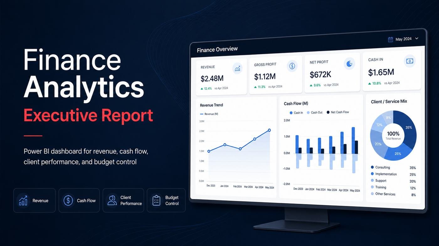
Finance teams and business owners often face the same challenge: the data exists, but the story is hidden. Revenue sits in one file, expenses in another, cash movement is tracked separately, and budget comparisons are reviewed manually at month-end — slowing decisions and letting problems become expensive before anyone notices. This report was built to solve exactly that problem, transforming raw financial data into a clean, interactive, decision-ready Power BI report that lets executives monitor revenue, COGS, opex, profit, margins, cash flow, client-level profitability and budget variance from one central environment.
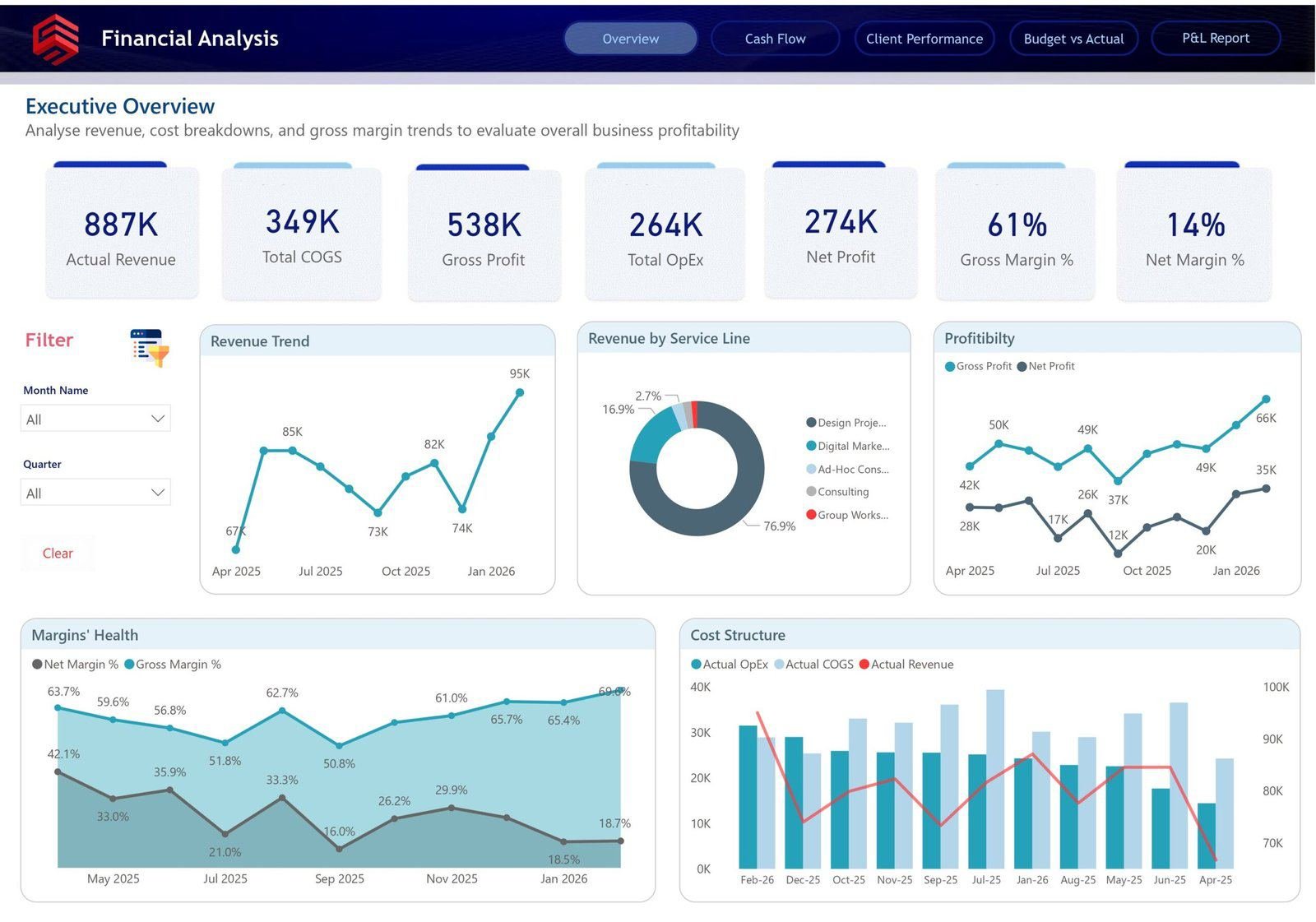
Executive Overview Dashboard
Gives leadership an instant snapshot of overall performance: Actual Revenue of $887K, Total COGS of $349K, Gross Profit of $538K, Total OpEx of $264K, Net Profit of $274K, Gross Margin of 61% and Net Margin of 14%. The revenue trend line shows growth patterns and slow periods, service-line breakdown reveals which work drives the business, and a cost-structure visual ties revenue, COGS and opex together to answer the core question: is the business financially healthy, and what's driving that performance?
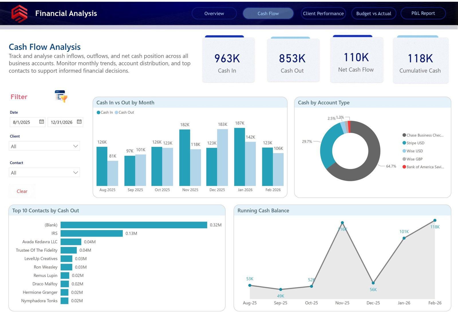
Cash Flow Analysis Dashboard
Focuses on liquidity — Cash In of $963K, Cash Out of $853K, Net Cash Flow of $110K and Cumulative Cash of $118K. Monthly Cash In vs Cash Out visuals reveal seasonal or client-driven cash pressure, a Cash by Account Type breakdown tracks funds across Chase Business Checking, Stripe, Wise and Bank of America accounts, and a Top-10-Contacts-by-Cash-Out view highlights major vendors and recurring expenses for spend control.
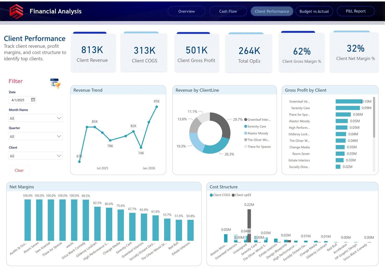
Client Performance Dashboard
Shifts the analysis to client-level profitability — Client Revenue of $813K, Client COGS of $313K, Client Gross Profit of $501K, Client Gross Margin of 62% and Client Net Margin of 32%. Ranking clients by gross profit and net margin (rather than revenue alone) surfaces which accounts are genuinely profitable and which consume too much delivery effort for too little return — supporting pricing, renegotiation and client-prioritisation decisions.
Budget vs Actual Dashboard
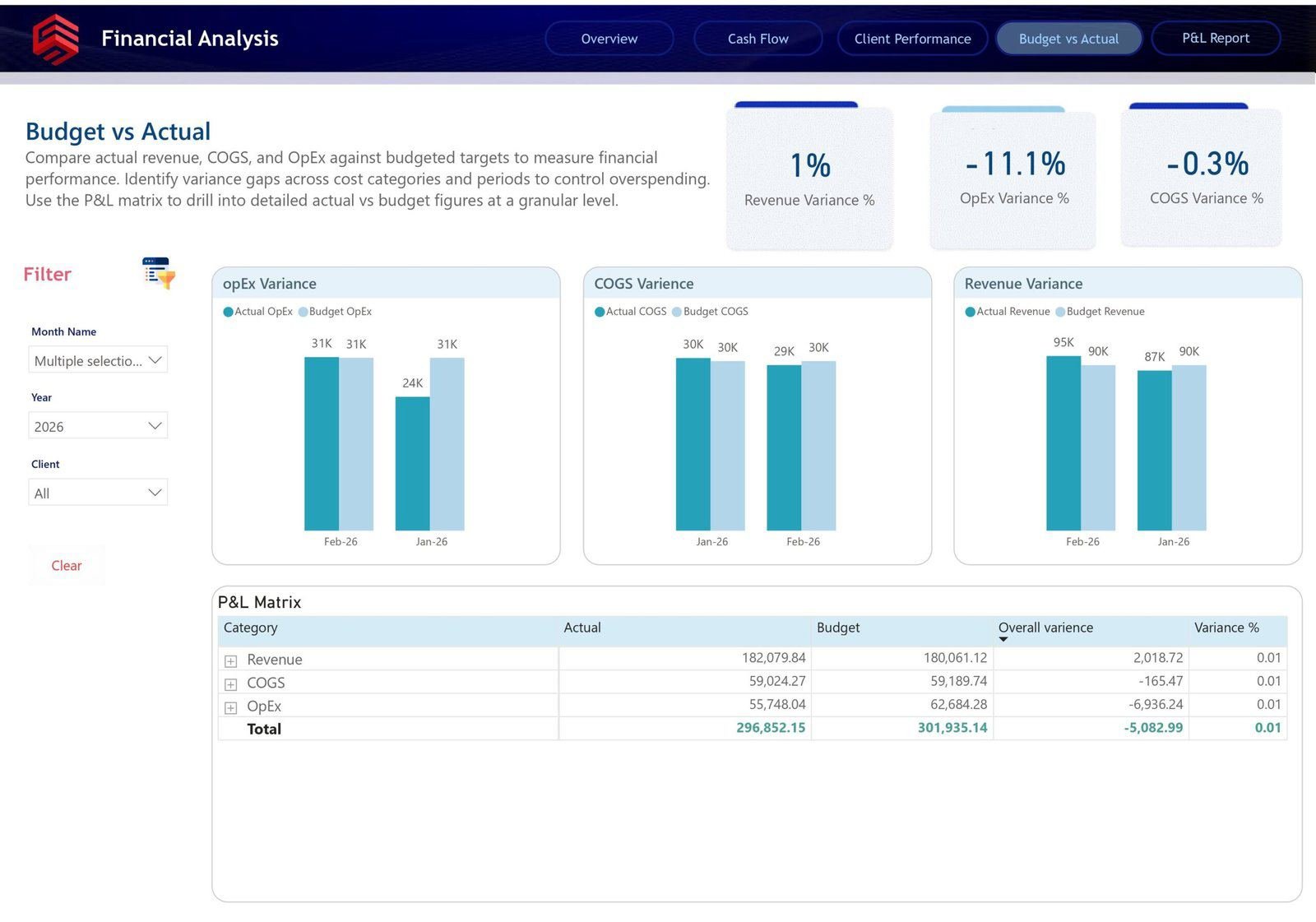
Compares planned financial performance against actual results through Revenue, OpEx and COGS variance KPIs. In this report, revenue showed a positive variance while OpEx and COGS ran negative — immediately flagging where actuals diverged from plan. A P&L Matrix at the bottom breaks variance down by category, letting users move from a headline percentage into the exact line items causing it.
P&L Matrix Dashboard
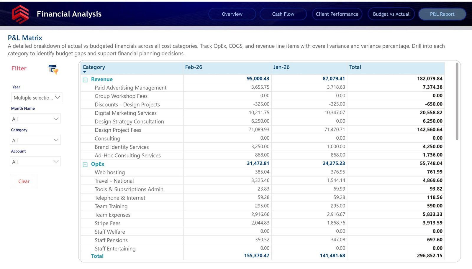
The most detailed financial view in the report — revenue expanded into specific income streams (Paid Advertising Management, Digital Marketing Services, Design Strategy Consultation and more) and opex broken into categories like Web Hosting, Travel, Tools & Subscriptions and Team Expenses. This connects summary reporting with accounting-level detail, so a stakeholder who spots an issue on the Budget vs Actual page can drill straight into the line item causing it.
Business impact
This report replaces manual review with interactive analysis and reduces dependency on static spreadsheets, connecting revenue, profit, cash, client profitability and budget variance into one complete financial story — enabling faster decisions, better cost control and more confident planning.