This proof of concept was built to demonstrate how interactive Power BI dashboards can transform raw sales data into actionable business intelligence for both leadership and analytics teams — moving from a clean executive summary down to granular, transaction-level exploration.
Executive Summary
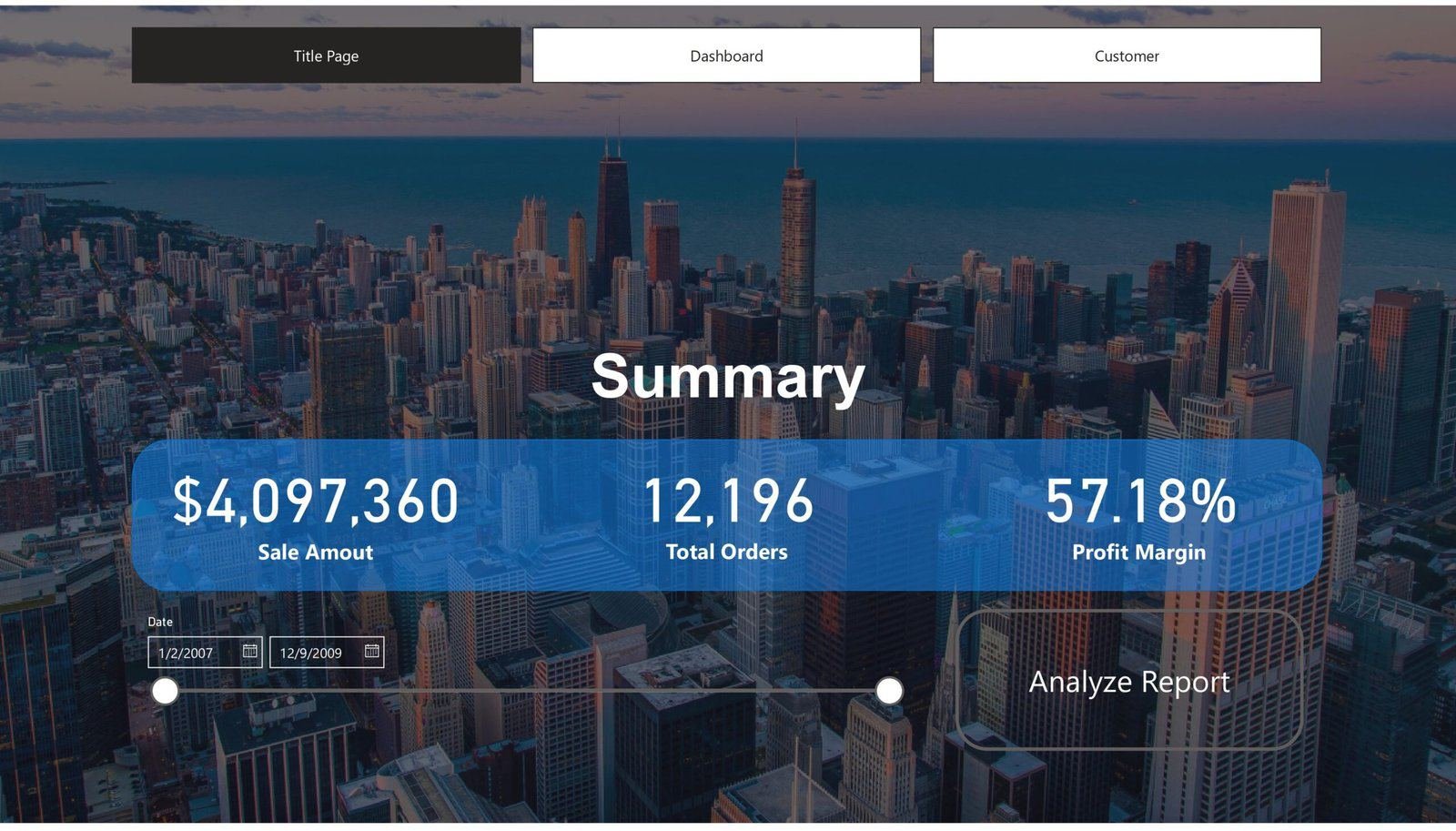
The executive overview of overall business performance — total sales amount, total orders and profit margin, presented with a clean, presentation-first design for senior stakeholders who need a quick, reliable summary without operational complexity. It establishes a strong analytical foundation by answering the most critical business question first: how is the business performing overall?
Sales Dashboard
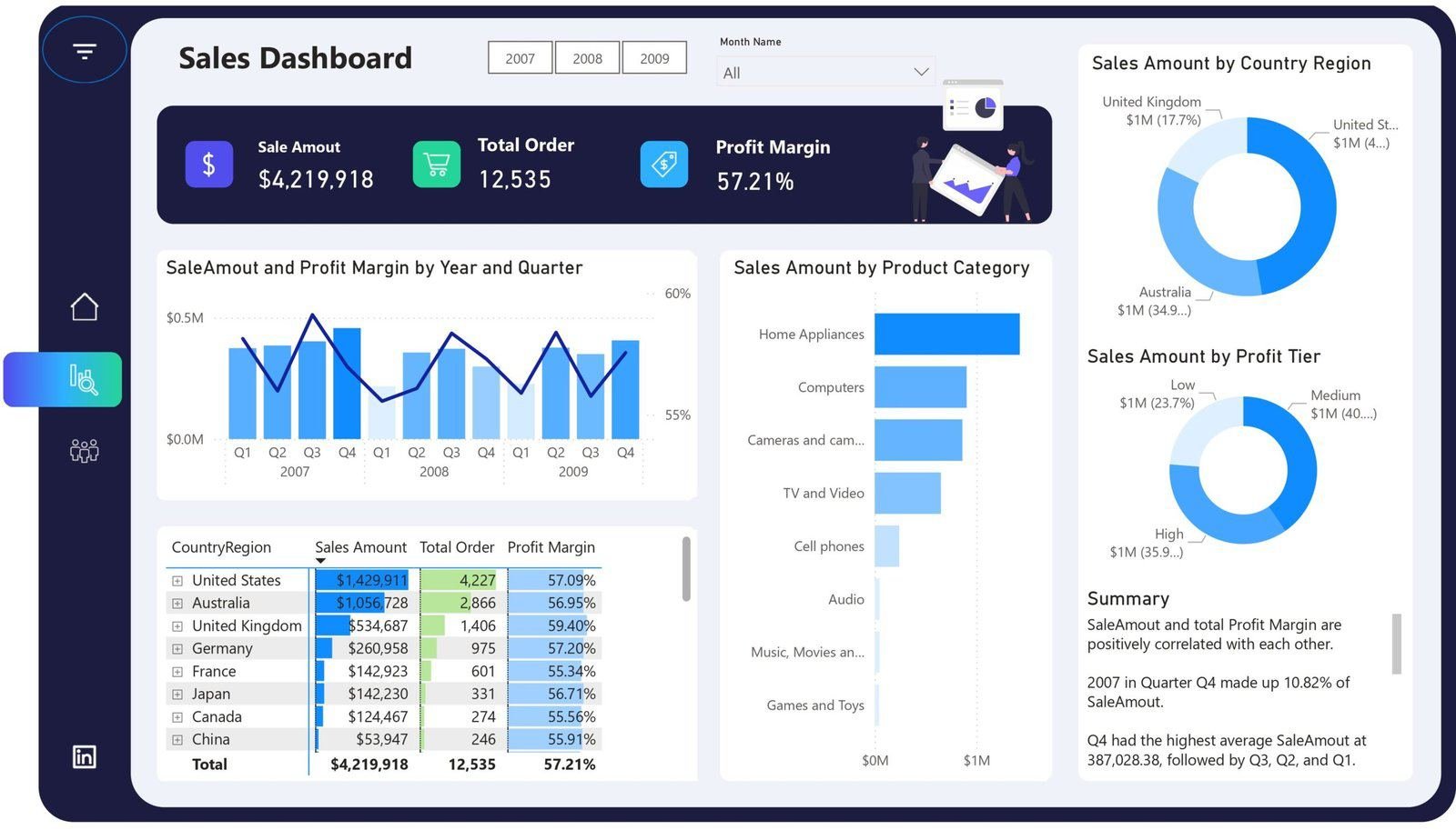
A deeper view into how sales and margins evolve across years, quarters, product categories, regions and profit tiers. It highlights seasonality and high-performing quarters, reveals which segments (Home Appliances, Computers, Electronics) contribute most to revenue, and separates high-, medium- and low-margin revenue streams for strategic sales optimisation.
Customer & Geography Analysis
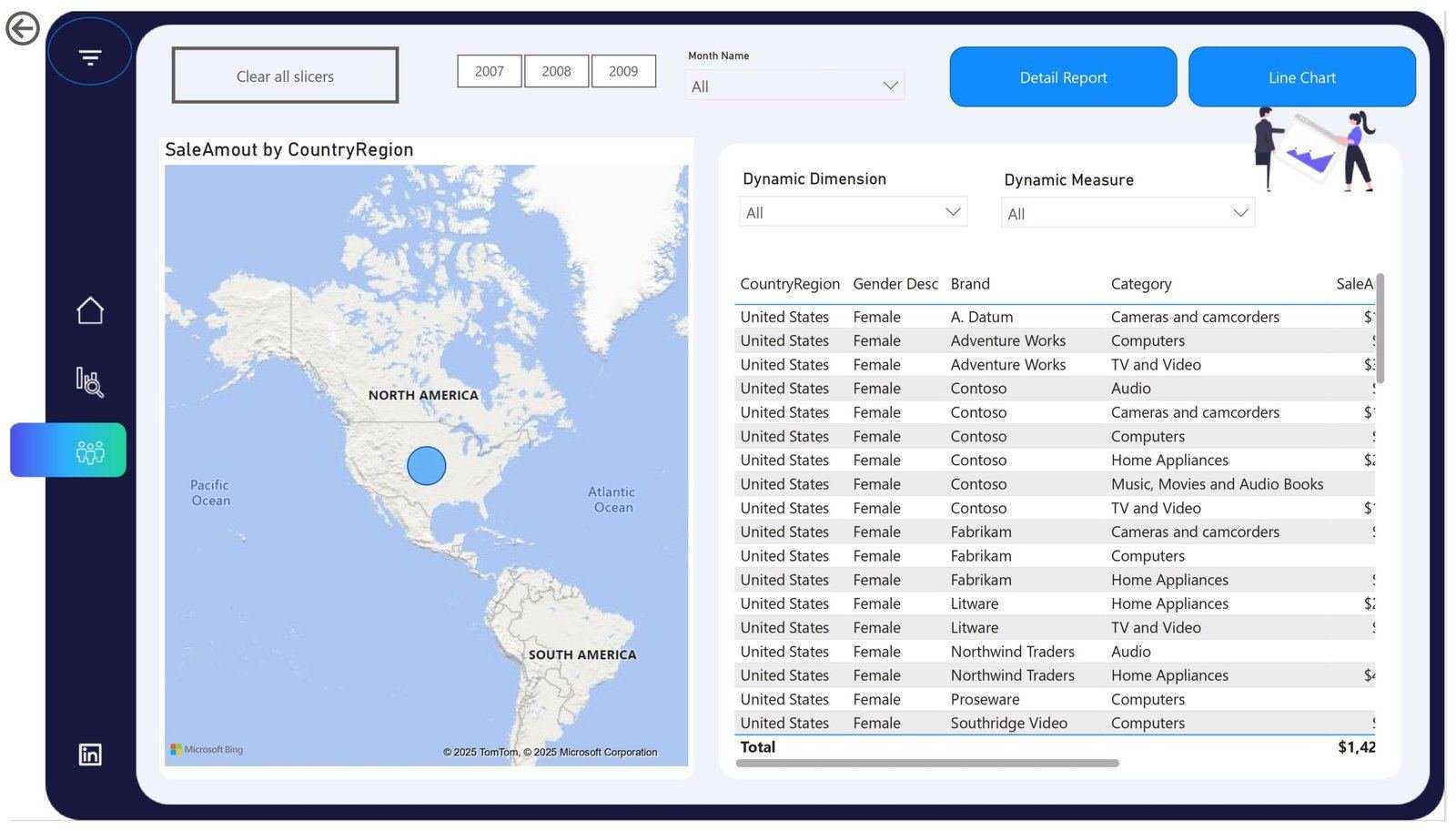
Granular, transaction-level insight combining customer, brand, category, geography and demographic dimensions into one interactive view. Dynamic dimensions and measures let users slice sales data by country, gender, brand, product category and time period, with a geographic map and detailed tabular report supporting both visual analysis and audit-level validation.