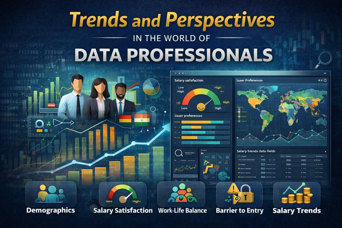
In this project, I gathered insights from a diverse pool of data professionals, creating a rich tapestry of information that paints a vivid picture of the industry — from who's in it, to what they're paid, to how they feel about the work.
Key features of the dashboard
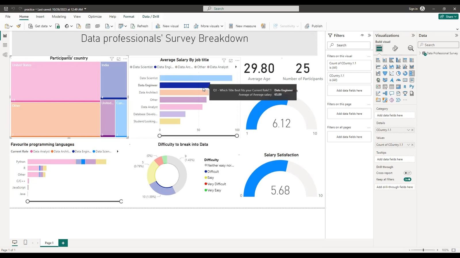
Demographic insights. The average age distribution of data professionals, offering a snapshot of the industry's generational makeup.
Salary satisfaction. Satisfaction levels with compensation, highlighting trends and variations across roles and experience levels.
Work-life balance. Work-life satisfaction across participants, shedding light on what contributes to a healthy balance in the dynamic field of data.
User preferences by country. Regional trends and variations in the tools, technologies and methodologies data professionals reach for.
Barriers to entry. The challenges faced by people entering the data profession, and how those barriers vary across different fields of data.
Salary trends across data fields. A comparison of salary data across fields within the profession, identifying the highest-paying roles and most lucrative sectors.
Conclusion
This dashboard leverages data-visualization techniques to transform a complex survey dataset into actionable insight — useful whether you're a seasoned data professional benchmarking your experience, or a newcomer trying to understand the industry landscape.