Sales → Insights: Building a Clean Power BI Sales Analytics Dashboard (POC)
This blog presents a Power BI sales analytics proof of concept designed to deliver executive-level summaries, in-depth sales and profitability analysis, and customer-level insights. The solution demonstrates how interactive dashboards can transform raw sales data into actionable business intelligence across leadership and analytics teams
DATA ANALYTICS
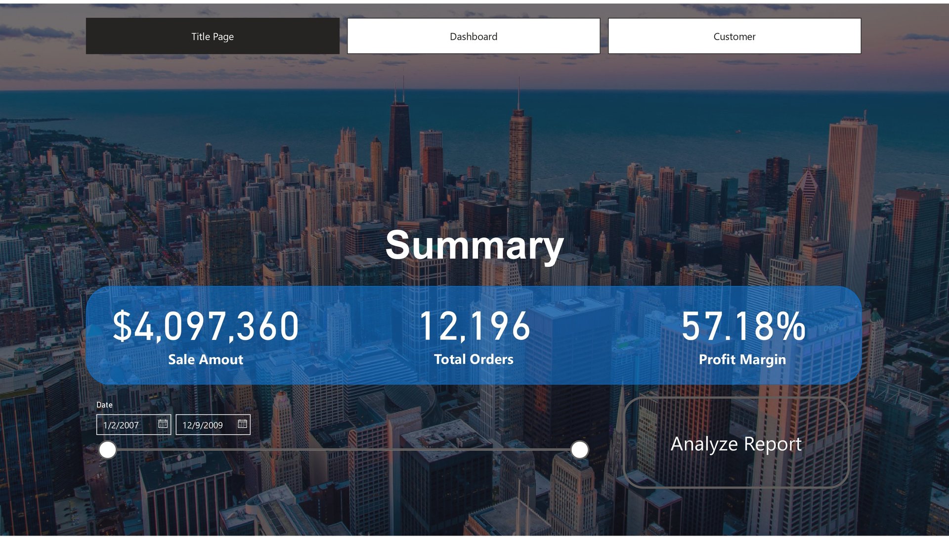
This dashboard serves as the executive overview of overall business performance, presenting a concise snapshot of sales, order volume, and profitability across the organization. Key KPIs such as total sales amount, total orders, and profit margin are prominently displayed, enabling leadership to instantly assess revenue health and margin efficiency over time. Built with a clean, presentation-first design, this dashboard is ideal for senior stakeholders who need a quick yet reliable summary without operational complexity. It establishes a strong analytical foundation by answering the most critical business question first: How is the business performing overall?
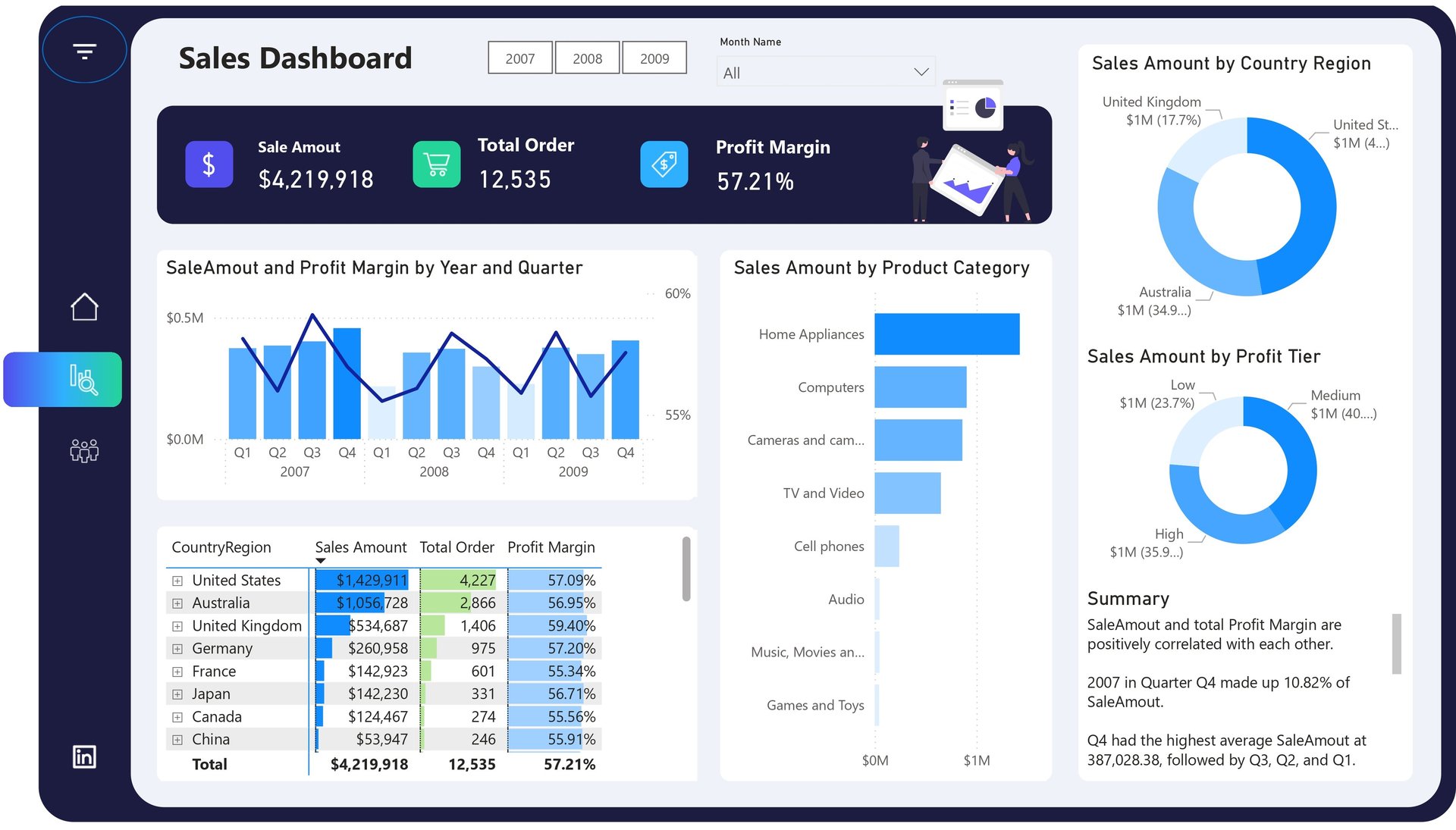
The Sales Dashboard provides a deeper analytical view into how sales and margins evolve across years, quarters, product categories, regions, and profit tiers. It highlights sales and profit margin trends over time, allowing users to identify seasonality and high-performing quarters. Product category analysis reveals which segments (such as Home Appliances, Computers, and Electronics) contribute most to revenue, while country-level breakdowns expose geographic performance differences. Profit-tier analysis further helps distinguish between high-, medium-, and low-margin revenue streams, making this dashboard a powerful tool for strategic sales optimization and profitability analysis
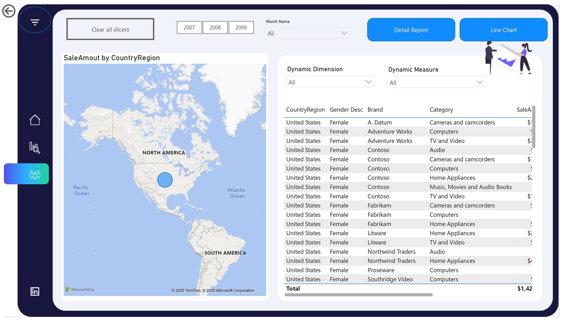
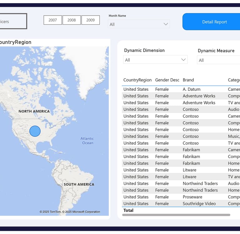
This dashboard focuses on granular, transaction-level insights by combining customer, brand, category, geography, and demographic dimensions into an interactive analytical view. With dynamic dimensions and measures, users can slice sales data by country, gender, brand, product category, and time period, enabling highly flexible exploration. The inclusion of a geographic map and detailed tabular report supports both visual analysis and audit-level validation. This dashboard is particularly valuable for analysts and business teams seeking to understand customer behavior, regional demand patterns, and brand-level performance beyond aggregated KPIs
Location
Karachi, Pakistan
Contacts
+92 336-2349646
ammarullahkhan5@gmail.com
Expertise
Transforming data into impactful stories for my clients