Finance Analytics Executive Report
Built an end-to-end Power BI Finance Analytics Report that gives executives a clear view of revenue, profitability, cash flow, client performance, budget variance, and detailed P&L movement. The report transforms scattered financial data into a clean, interactive decision-making tool, helping business leaders track financial health, control costs, identify profitable clients, and compare actual performance against budget targets.
Overview
Finance teams and business owners often face the same challenge: the data exists, but the story is hidden. Revenue sits in one file, expenses in another, cash movement is tracked separately, and budget comparisons are often reviewed manually at month-end. This slows down decision-making and makes it difficult to identify problems before they become expensive.
This Finance Analytics Executive Report was built to solve exactly that problem.
The solution transforms raw financial data into a clean, interactive, and decision-ready Power BI report. It allows executives, finance managers, and business stakeholders to monitor actual revenue, cost of goods sold, operating expenses, gross profit, net profit, margins, cash inflows, cash outflows, client-level profitability, and budget variance from one central reporting environment.
The design follows an executive-first approach. Each dashboard page answers a specific business question. The Overview page explains overall financial health. The Cash Flow page shows whether money is actually moving in the right direction. The Client Performance page highlights which clients are driving revenue and profit. The Budget vs Actual page compares financial targets against real performance. Finally, the P&L Matrix provides a detailed accounting-level breakdown for deeper financial investigation.
This is not just a reporting project. It is a financial control system built inside Power BI.
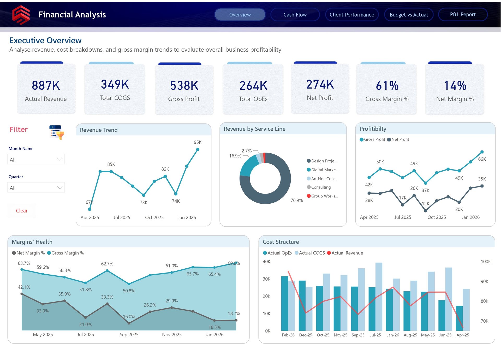
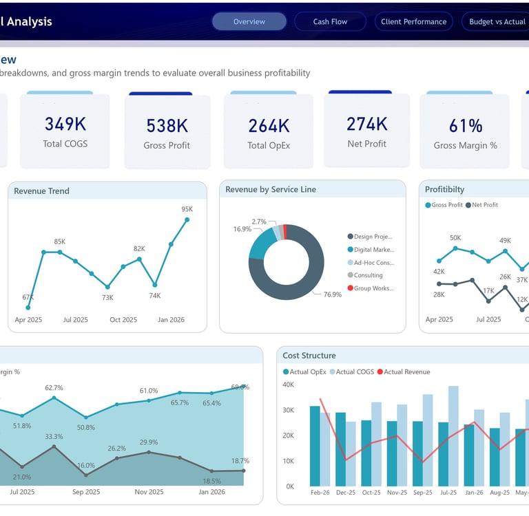
Executive Overview Dashboard
The Executive Overview dashboard gives leadership an instant snapshot of overall business performance. At the top, key financial KPIs are clearly presented, including Actual Revenue of 887K, Total COGS of 349K, Gross Profit of 538K, Total OpEx of 264K, Net Profit of 274K, Gross Margin of 61%, and Net Margin of 14%. These figures allow decision-makers to understand profitability without digging through rows of financial data.
The dashboard then moves from summary to explanation. The revenue trend line shows how revenue has moved across months, helping leaders identify growth patterns, slow periods, and revenue spikes. The service line breakdown reveals that the majority of revenue comes from design project-related work, making it easy to understand which service area is currently driving the business.
Profitability is also presented in a practical way. The gross profit and net profit trend highlights the gap between revenue generation and actual bottom-line performance. This is important because a business can grow revenue while still losing margin efficiency. The margin health chart adds another layer by showing gross and net margin movement over time, making it easier to spot whether profitability is improving, weakening, or becoming unstable.
The cost structure visual ties everything together by comparing actual revenue, COGS, and operating expenses. This gives finance leaders a clear view of how much revenue is being converted into profit after direct and operational costs. In simple terms, this page helps answer the most important executive question: Is the business financially healthy, and what is driving that performance?
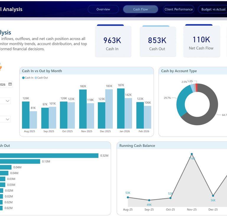
Cash Flow Analysis Dashboard
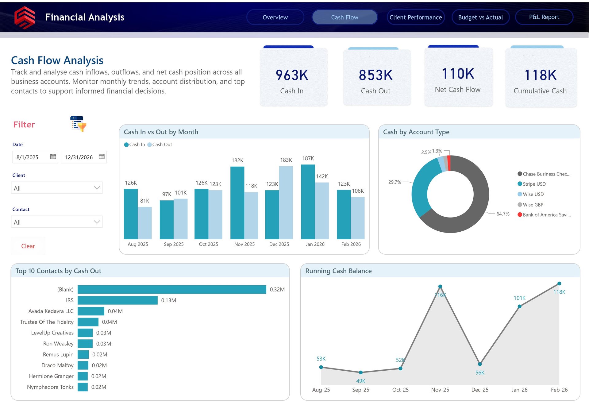
The Cash Flow Analysis dashboard focuses on one of the most critical areas of any business: liquidity. Profit is important, but cash flow determines whether a business can operate smoothly, pay vendors, invest in growth, and handle unexpected expenses.
This page summarizes the company’s cash movement with four major KPIs: Cash In of 963K, Cash Out of 853K, Net Cash Flow of 110K, and Cumulative Cash of 118K. These numbers immediately show that the business has generated a positive cash position during the selected period.
The monthly Cash In vs Cash Out chart provides a more detailed view of inflows and outflows across time. This is where decision-makers can identify months where cash collection was strong, months where outflows increased, and periods where the business may need tighter cash control. For example, the dashboard shows visible fluctuations between months, which helps finance teams understand whether cash pressure is seasonal, operational, or client-driven.
The Cash by Account Type visual adds another practical layer by showing where cash is held across different accounts, such as Chase Business Checking, Stripe USD, Wise USD, Wise GBP, and Bank of America Savings. This is valuable for businesses managing multiple bank accounts or payment platforms because it helps ensure funds are not just available, but visible and trackable.
The Top 10 Contacts by Cash Out chart is especially useful for spend control. It highlights the largest recipients of cash outflows, helping the business identify major vendors, recurring expenses, tax payments, or unusual cash movements. The Running Cash Balance visual then shows how the overall cash position changes month by month, giving leadership a simple way to monitor liquidity risk.
This dashboard helps answer a very practical business question: Are we generating enough cash, where is it going, and do we have enough liquidity to operate confidently?
Client Performance Dashboard
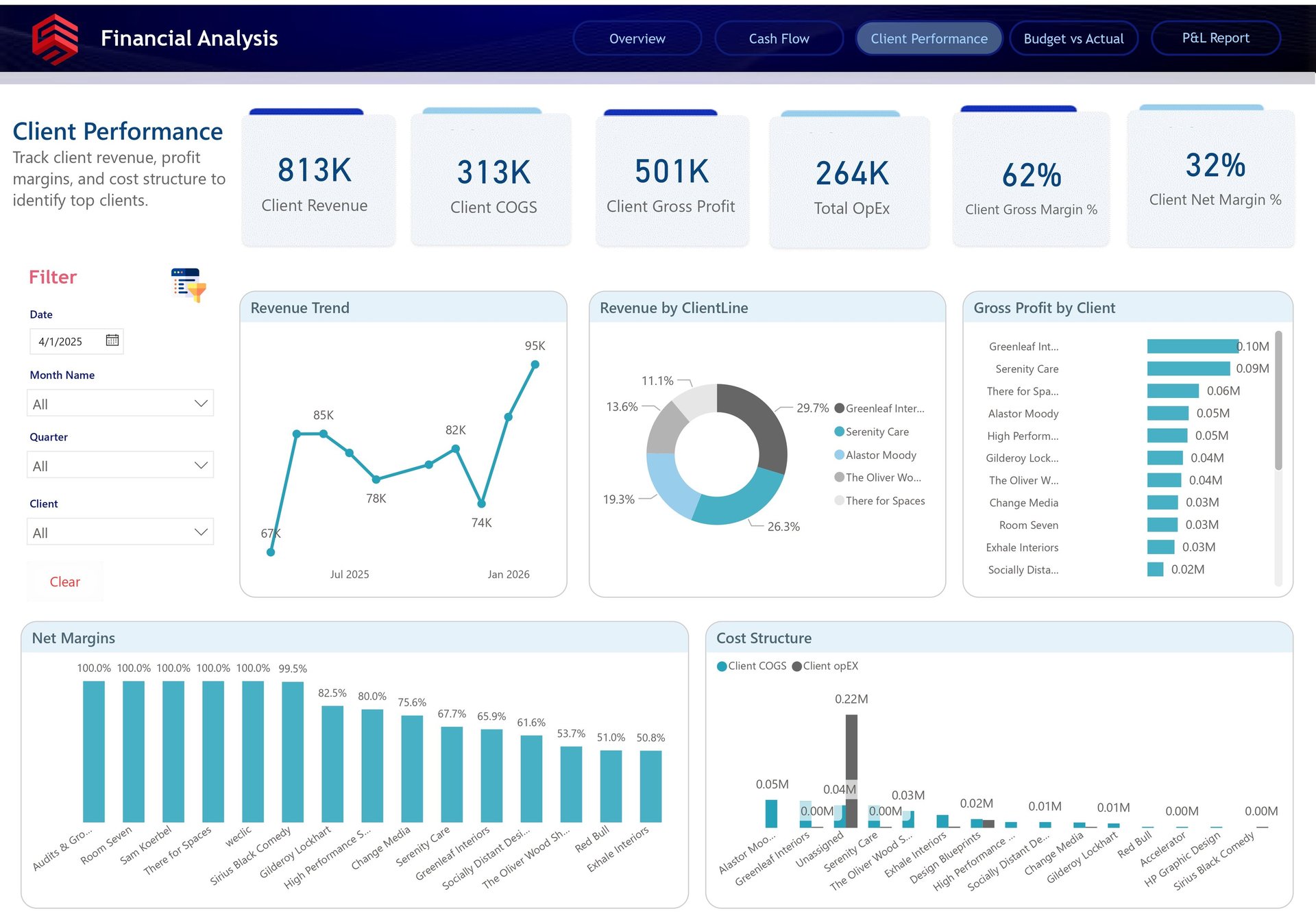
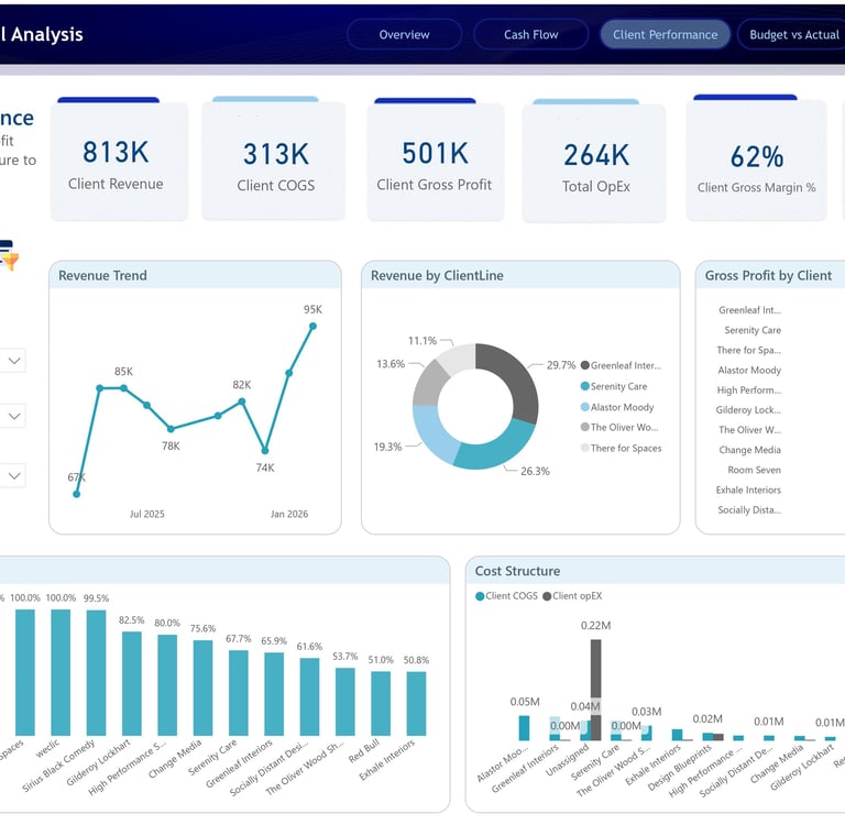
The Client Performance dashboard shifts the analysis from overall company performance to client-level profitability. This is where the report becomes especially powerful for strategic decision-making.
At the top, the dashboard presents client-specific KPIs including Client Revenue of 813K, Client COGS of 313K, Client Gross Profit of 501K, Total OpEx of 264K, Client Gross Margin of 62%, and Client Net Margin of 32%. These metrics help the business understand not only which clients generate revenue, but which clients actually contribute meaningful profit.
The revenue trend visual tracks how client revenue changes over time, allowing the business to identify growth momentum or revenue dependency. The Revenue by Client Line donut chart breaks down revenue contribution across top clients, showing which accounts make up the largest share of income. This is important because a business can look healthy on the surface while being overly dependent on a small number of clients.
The Gross Profit by Client chart gives a deeper and more useful view than revenue alone. Some clients may bring high revenue but also require high delivery costs. Others may generate lower revenue but deliver stronger margins. By ranking clients based on gross profit, the dashboard helps identify the accounts that truly matter from a profitability perspective.
The Net Margins chart provides even sharper insight. It shows how efficiently different clients convert revenue into profit after costs. This can support better pricing decisions, contract renegotiation, client prioritization, and resource planning. If a client is consuming too much operational effort for too little return, this page makes that visible.
Finally, the Cost Structure visual compares client-level COGS and OpEx, making it easier to understand which clients are cost-heavy and where profitability may be leaking. This dashboard helps answer a question every service-based business needs to ask regularly: Which clients are actually profitable, and which ones need better pricing, delivery control, or strategic review?
Budget vs Actual Dashboard
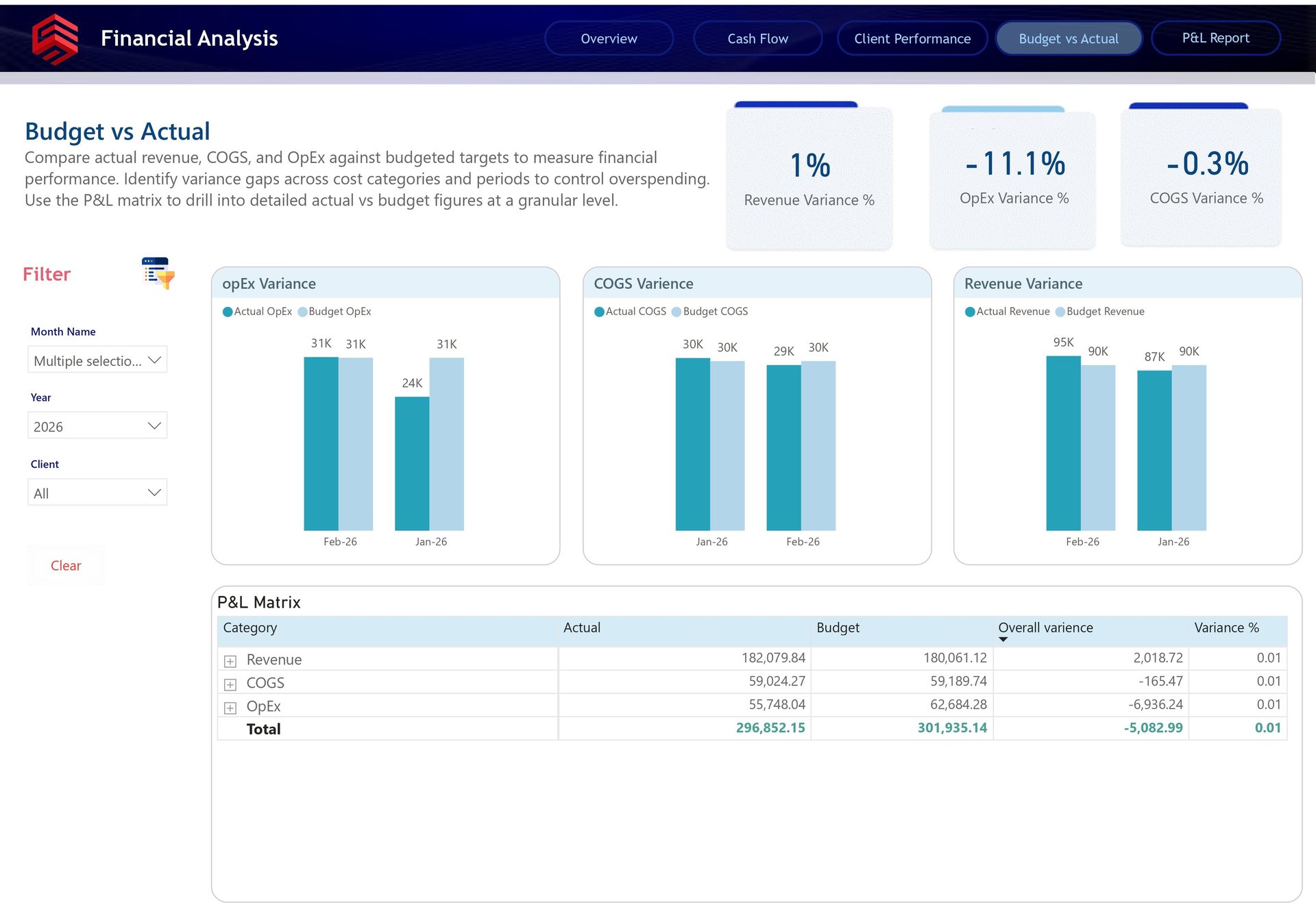
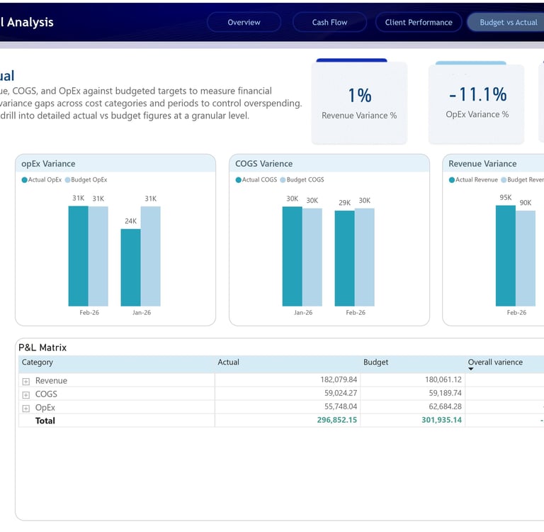
The Budget vs Actual dashboard was designed to help the business compare planned financial performance against actual results. This is one of the most important dashboards for financial discipline because it shows whether the company is staying aligned with its targets or drifting away from budget expectations.
The dashboard highlights three key variance KPIs: Revenue Variance %, OpEx Variance %, and COGS Variance %. These figures allow finance teams to quickly see where performance is ahead or behind plan. In the report, revenue shows a positive variance, while OpEx and COGS show negative variances, helping stakeholders immediately identify where actuals differ from the budget.
The OpEx Variance chart compares actual operating expenses against budgeted operating expenses by month. This helps the business identify whether operating costs are under control or whether certain months had unexpected overspending. The COGS Variance chart performs a similar comparison for direct costs, making it easier to track delivery efficiency and cost management.
The Revenue Variance chart compares actual revenue against budgeted revenue. This is essential for understanding whether the business is meeting sales expectations. Even a small revenue variance can matter when paired with cost movement, because profitability depends on both revenue achievement and expense control.
The P&L Matrix at the bottom adds the detailed financial layer. It breaks down actual, budget, overall variance, and variance percentage by category, including Revenue, COGS, and OpEx. This allows users to move from a high-level variance percentage into the exact financial line items behind the result.
This page helps answer the question: Are we performing better or worse than planned, and which financial category is causing the difference?
P&L Matrix Dashboard
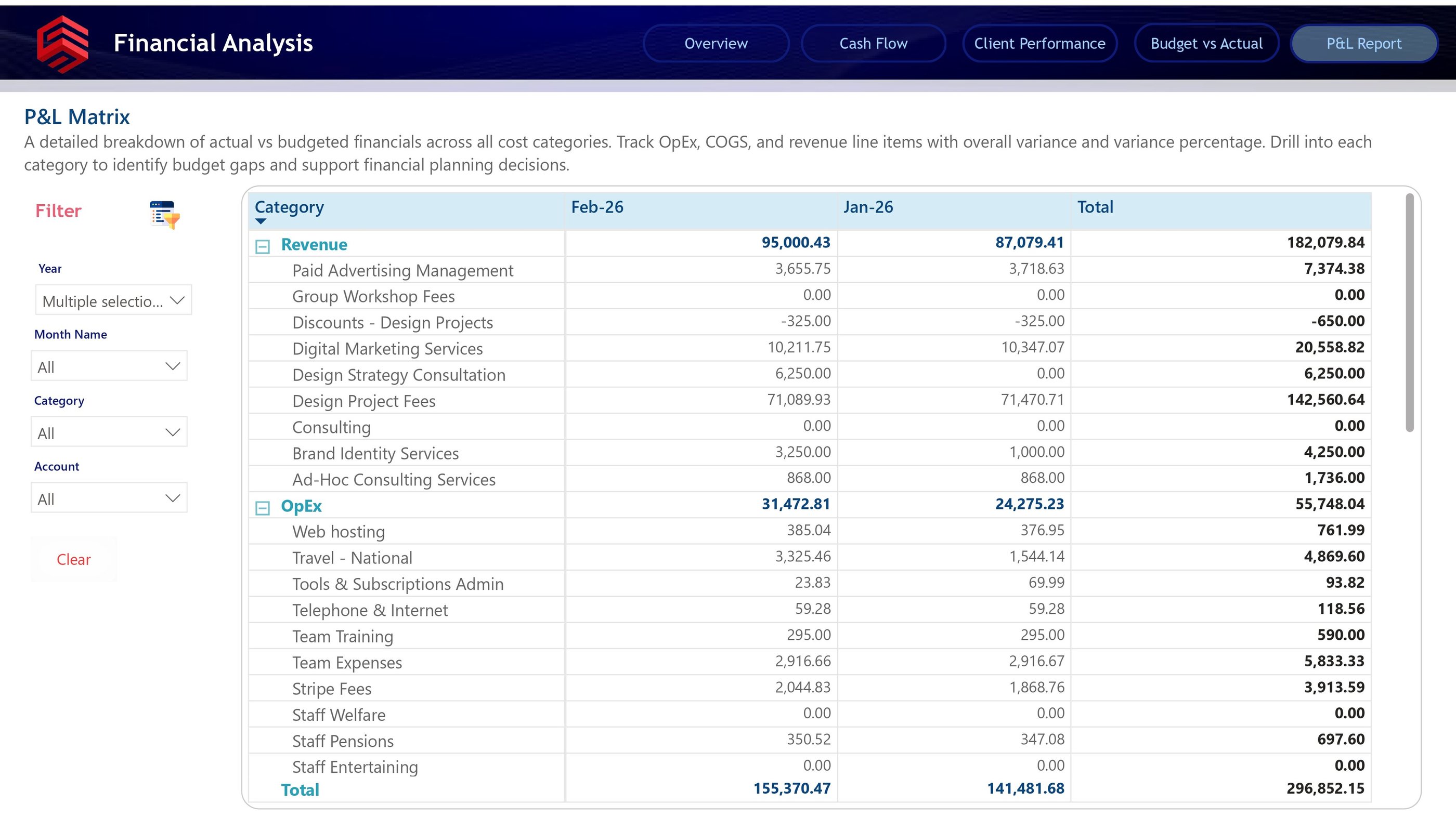
The P&L Matrix dashboard provides the most detailed financial view in the report. While the other pages are designed for visual analysis and executive decision-making, this page is built for deeper financial review.
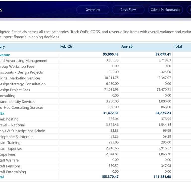
The matrix breaks down financial results by category, month, and account. Revenue is expanded into specific income streams such as Paid Advertising Management, Digital Marketing Services, Design Strategy Consultation, Design Project Fees, Brand Identity Services, and Ad-Hoc Consulting Services. This gives finance teams and business owners the ability to see exactly which revenue lines are contributing to total income.
The OpEx section provides the same level of detail for expenses. Categories such as Web Hosting, Travel, Tools & Subscriptions, Telephone & Internet, Team Training, Team Expenses, Stripe Fees, Staff Pensions, and other operational costs are listed separately. This makes it easier to review cost behavior and identify areas where spending can be optimized.
What makes this page valuable is its ability to connect summary reporting with accounting-level detail. A stakeholder may first notice an issue on the Budget vs Actual dashboard, then use the P&L Matrix to drill into the exact line item causing the variance. This creates a smooth investigation flow from executive summary to financial detail.
For example, if OpEx is higher than expected, the user does not need to manually open spreadsheets or ask finance for a separate breakdown. They can use the matrix to identify whether the increase came from travel, subscriptions, team expenses, payment fees, or another operating category.
This dashboard helps answer the final layer of financial analysis: What exactly is driving our revenue, cost, profit, and budget variance at the line-item level?
Business Impact
This Finance Analytics report gives the business a stronger financial decision-making foundation. It replaces manual review with interactive analysis, reduces dependency on static spreadsheets, and gives stakeholders a clear view of both high-level performance and detailed financial drivers.
The biggest value of this project is not only in the visuals. It is in the way the report connects different financial questions into one complete story:
How much revenue did we generate?
How much profit did we keep?
Where did the cash go?
Which clients are worth focusing on?
Are we above or below budget?
Which line items caused the difference?
By answering these questions in one Power BI solution, the report enables faster decisions, better financial control, and more confident planning.
For any business that wants to move from reactive finance reporting to proactive financial management, this type of dashboard is not just useful. It is essential.
Location
Karachi, Pakistan
Contacts
+92 336-2349646
ammarullahkhan5@gmail.com
Expertise
Transforming data into impactful stories for my clients